Case
The iPhone Keyboard - Make It or Break It
The first ever iPhone was unveiled by Apple CEO Steve Jobs in 2007, in what is today considered a legendary demo of a legendary product. A big part of Jobs’s presentation was a section about keyboards. At the time, most phones had physical keyboards — plastic chiclets that occupied the bottom half of the phone, below a small screen. In his presentation, Jobs threw shade at this design:
“(These phones) all have these keyboards that are there whether you need them or not. And they all have these control buttons that are fixed in plastic, and are the same for every application … well, every application wants a slightly different user interface, a slightly optimised set of buttons just for it. And what happens if you think of a great idea six months from now — you can’t add a button to these things — they’re already shipped! So what do you do?”
Jobs argued that the solution was a software keyboard, displayed on a large touchscreen, and adapted to every application on the phone. Today, we take the touchscreen keyboard for granted. But at the time, this was a novel idea — touchscreens were mostly pressure-sensitive instead of capacitive, and therefore extremely difficult to use.
What most people don’t know is that the development of the touchscreen keyboard nearly tanked the iPhone. In Creative Selection, Apple software engineer Ken Kocienda tells the story of the iPhone keyboard — and what it took to build it when they were attempting to make the first modern smartphone.
When Kocienda asked to join the new iPhone project, he had to sign a special NDA before his boss Henri Lamiraux told him what he had signed up for: “Yeah, we’re making a cell phone. Its code name is Purple.”
There was a lot to do. At the time that Kocienda joined in July 2005, Project Purple’s software was nothing more than a handful of user interface demos — a row-and-column home screen named Springboard, and a fluid inertial scrolling mechanism that bounced playfully once you reached the end of a list.
The stakes were also incredibly high. Jobs was watching Purple obsessively — the phone was to be a bet-the-company moment.
Over the course of the next few months, the Project Purple software team went through the gamut of software demos. There were demos for early versions of the app-launching animation, demos to test the font size on the phone screen, demos for early prototypes of apps like Contacts and Calendar. After each demo, the leaders would ask themselves: “Did this demo close the prototype-to-product gap, even a little? Were they seeing positive change over the previous demo? Is this technology or app on track?”
By around September 2005, a major problem had emerged. In a particularly difficult product demonstration for Purple’s keyboard, smartphone exec Scott Forstall (who reported directly to Steve Jobs) was unable to type anything intelligible. Kocienda recounts, from that period:
The onscreen keyboard produced not just wrong words but babble. Scott kept trying, deleting backward and then typing again. Every effort ended in gobbledygook. Eventually, Scott shifted the Wallaby (the prototype smartphone) to his left hand and tilted it to a near forty-five-degree angle to his face. Holding it closer, he focused intently on the screen and slowly moved his right index finger toward the S key, intending to type the first letter of his name. He couldn’t. The keys were too small, and the software was hopelessly confused. No matter what he tried, Scott couldn’t type “Scott.” He called an end to the demo, put down the Wallaby, and the demo group moved on.
A few days later, Lamiraux pulled all the Purple programmers out of their offices. He told them to immediately stop what they were doing and focus on making a workable keyboard instead. The disastrous September demo had raised red flags up and down the management chain — leadership thought that progress on the keyboard was simply too slow. Kocienda wrote, of this event:
As I listened to Henri, I wondered whether this was a last-ditch effort to get keyboard development back on track. What if we couldn’t? Would Purple be cancelled? Henri didn’t come out and say it that way, but he didn’t have to. In all my years at Apple, we’d never before halted a fifteen-person project to focus everyone on a single problem.
Nobody on the 15-engineer team quite knew what the ideal software keyboard would look like. Over the next few weeks, the engineers developed a wide variety of prototypes. One developed a Morse-code-inspired keyboard which would have the user combine taps and slides to mimic dots and dashes. Another developed a piano-like keyboard where users would need to click multiple keys at once (hence the name) to type a specific letter. The remaining prototypes downsized the usual QWERTY keyboard, but these came with their own set of problems. The buttons were too small and there was no tactile feedback to tell the user whether they had hit or missed the button.
Kocienda’s first prototype was a ‘blob’ keyboard. There would be three letters assigned to each blob, and to type out one of the three letters, the user would either tap, swipe left, or swipe right on the blob. While this ensured that keyboard buttons were large enough to tap on, it created another problem — typing a common word like “bank” would require a complicated sequence of different gestures:
Swipe left on the 'abc' key.
Tap on the 'abc' key.
Tap on the 'nyz' key.
Swipe right on the 'ejk' key.
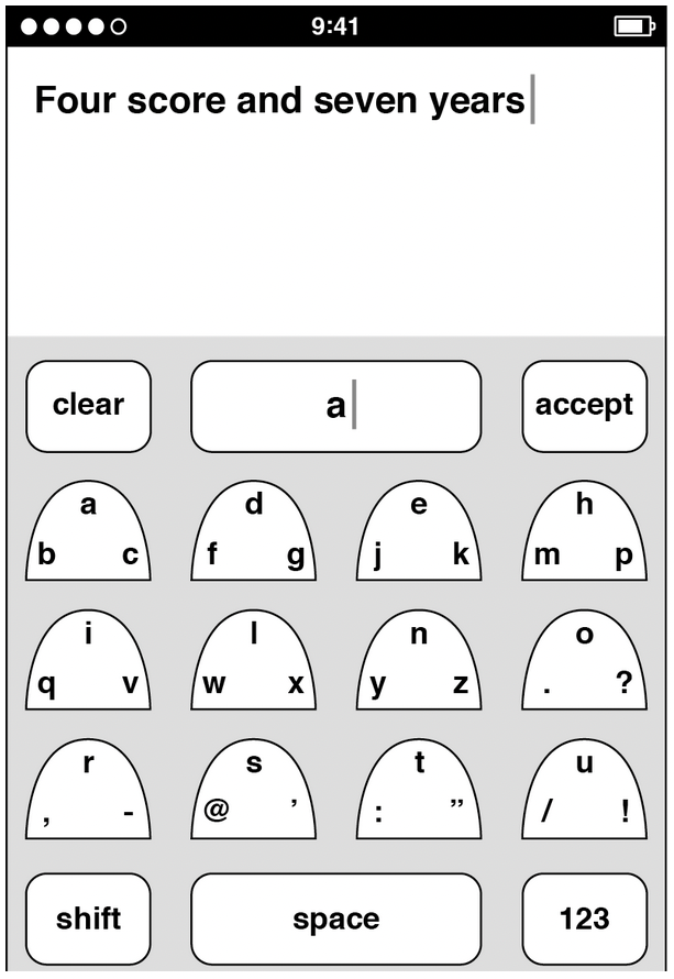
Image sourced from Creative Selection by Ken Kocienda.
It was terrible. Kocienda moved on. His next prototype would build on his newly-discovered principles of keyboard design:
Big keys for easy tapping.
Stick to the common QWERTY format.
Keys should be tap only. No fancy gestures.
This prototype would have two or three letters form a large clickable button. As users tapped them, a dictionary software would determine the most sensible word out of the combination of keys and letters and offer another button to tap for it.
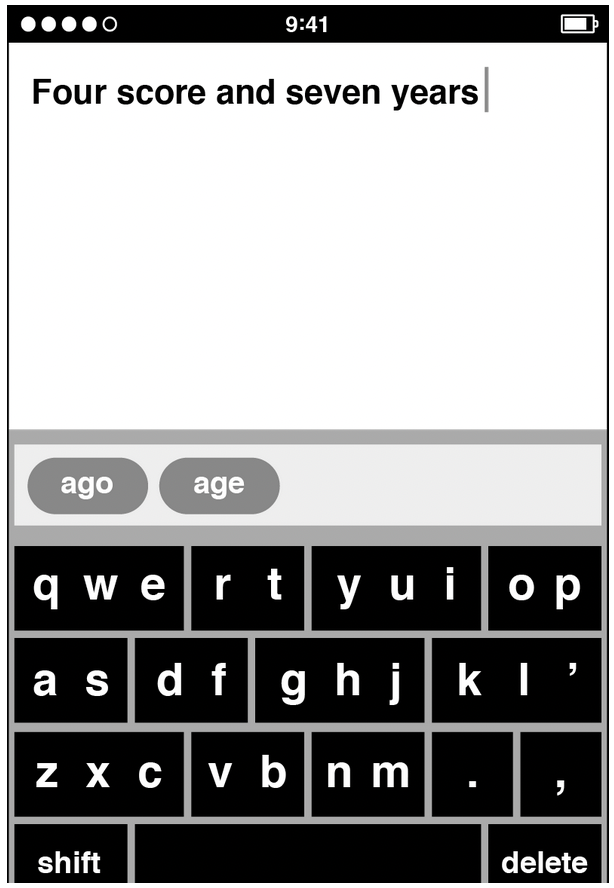
Image sourced from Creative Selection by Ken Kocienda.
Kocienda brought this prototype to their next keyboard demonstration. As Scott went through the different demos, he still had a difficult time typing out simple words. He could barely spell out his name ‘Scott’. But when he tried to thumb type his name with Kocienda’s prototype, it worked. His name appeared on the screen. Moving onto a longer sentence, he then typed out “Scott is my name”. Again, no spelling errors and the dictionary assistance worked. “This is amazing!” he exclaimed. Then Forstall’s questions started raining down — “Why are there multiple letters on the keys? How does the software know which letter I wanted? How does it figure out the word I meant? How did you put the dictionary together?”
The next day, Lamiraux told Kocienda that the keyboard crisis was over. They would have him be the DRI to develop the phone keyboard going forward. Forstall didn’t even ask if he wanted the job. And Kocienda knew what it meant — at Apple, being a ‘Directly Responsible Individual’ meant that his butt was on the line. He had to do whatever it took to make the keyboard a success.
The keyboard crisis was over, but the work just got started. Apple’s embarrassing failure with text input technology in their Newton PDA, a decade earlier, meant that leadership was especially harsh on Kocienda’s keyboard prototype. When Apple’s top marketing executive Phil Schiller tried out Kocienda’s software, he concluded in less than two minutes that it wasn’t good enough. He questioned Kocienda’s design of having more than one letter on every key. Days later, iPod executive Tony Fadell tried it out. He was done in less than a minute and gave the same tepid response.
Kocienda took a closer look at his keyboard prototype and found new problems with his approach. The dictionary assistance worked well enough for common words, but what if the user wanted to type non-English names like the popular Finnish name ‘Teemu’? If the dictionary didn’t have it, the keyboard couldn’t type it out. A similar problem emerged if the user wanted to celebrate International Talk Like a Pirate Day on September 19. They might want to type out ‘Arrrrrr!’ but the dictionary would not have an equivalent word with the exact number of ‘r’s. In theory, Kocienda could fix this by adding all non-English names in existence and all the different versions of slang to his dictionary, but that would be near impossible.
To make things worse, Kocienda’s prototype created another problem. As his teammates tested the keyboard, they would sometimes pause from typing to have a think or chat with a coworker and when they returned to typing, they wouldn’t know what to type next from their half-formed word. For example, if they were typing out the word ‘aluminum’, paused, and returned to the keyboard, it would display the word ‘slimy’. But that’s not what the user wanted. They would need to remember they were halfway through typing the word ‘aluminum’ and calculate what letter to type next, while being distracted by the word ‘slimy’. More often than not, they would erase the entire word in frustration and retype.
This exact problem played out during a progress review three months after the keyboard crisis. Forstall was typing a medium-length word, ‘national’, but after tapping four keys, he was thrown off after seeing the suggested word ‘Mary’ and after typing another letter, the suggested word changed to ‘Mario’. By now, he was just totally lost and didn’t know what letter to type next to spell ‘national’. At that point, Human Interface manager Greg Christie interrupted and said “Aww… come on, Ken! Can’t you just put one letter on every key?”.
Kocienda then decided that every letter of his keyboard should have its own button. And the dictionary assistance software would be fine-tuned so that it understood if you had tapped the wrong key nearby. When Kocienda was done, his manager Richard Williamson tested the new keyboard. He put his head down, jabbed and jabbed at the touchscreen, and only when he was done typing did he look up at the results.
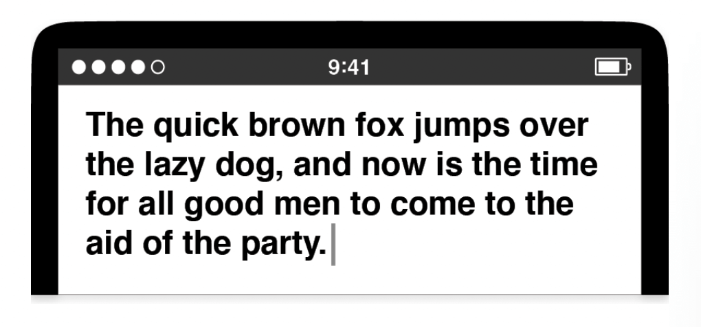
Image sourced from Creative Selection by Ken Kocienda.
Both of them laughed. It was a flawless result. It was only when they looked at their raw typing input did they realise how much autocorrect had stepped in. The raw input read:
Tge quixk brpwm foz jimprd ivrr rhe kazy…
Over the next year, Kocienda would continue refining the autocorrect software to become more accurate and more forgiving towards the user’s accidental taps. This would be the keyboard Steve Jobs introduced in his 2007 iPhone keynote. And while there were plenty of other pieces that went into the final iPhone launch, the keyboard was a major, and necessary, part of the product’s eventual success.
Questions
Compare this case with a previous case you've read. What is similar? What is different?
Does this remind you of a similar case? If so, what is different there?
If you have any thoughts, feel free to comment in the member's forum.
Sources
Creative Selection by Ken Kocienda. Published in 2018.