
Note: this is Part 12 in a series of blog posts about becoming data driven in business. This piece is the culmination of one and a half years of investigation and then practice, and sets up for a two-parter explaining the Amazon-style Weekly Business Review.
I’m going to attempt something ambitious with this essay: I will explain how one might go from ‘understanding variation’ to the structure of the Amazon-style Weekly Business Review (WBR).
This piece will set up for the next two essays in the Becoming Data Driven series, which will describe the actual practice of the WBR. And though it might not seem like it, I believe this piece is actually the more important one. With the WBR you get a pre-packaged metrics practice that Amazon has honed over years of trial and error. That is in itself incredibly valuable, because it’s something you can apply immediately — assuming you’re willing to put in the work. But it’s really the principles of Statistical Process Control (and/or Continuous Improvement; pick your poison) that you want to internalise, because it is those principles that led to the WBR, and it is through those principles that you can come up with equivalently powerful mechanisms of your own.
So here’s what I’m going to do: I’ll walk you through the core insight at the heart of this body of work, and then we’ll go through how one might build on top of these ideas until you come up with something very similar to the WBR, from scratch, using the same worldview and ideas that I’m sure the early leaders of Amazon drew on.
If I do this right, you will — hopefully — not be able to look at data the same way again.
Why Become Data Driven?
Before we get started, though, I want to talk about why all of this is important. What is the goal of data in business? Why become data driven in the first place?
This is a controversial topic, and for good reason. On the one hand, you might say “of course we should be data driven — that’s just what good businesspeople do!” Notice the expectation embedded in that sentence. Never mind that few of us, if any, have ever been taught basic data literacy. Never mind that — if pushed — most of us can’t really articulate how we can become more data driven. As my friend Ergest Xheblati likes to say (I’m paraphrasing here, but only slightly): “executives are expected to be data driven, even if they don’t know what it means”. There is a prevailing sense that ‘data is good’ and this sense has seeped into the broader culture of business.
At the other end of the spectrum, there are many screeds about why becoming ‘data driven’ is bad, about how we should be ‘data informed’ instead, about why “just looking at the numbers” can lead one astray. Earlier in the Data Driven Series I wrote — quoting an acquaintance — that “using data is like using nuclear power: it’s incredibly powerful when used correctly, but so very easy to get wrong, and when things go wrong the whole thing blows up in your face”. This captures a stance that I think has proliferated widely. We can all quote stories about misaligned incentives, or bad financial abstractions, or stories about warped organisational behaviour — all enabled by or caused by dumb usage of data. It’s too easy to throw shade at the very idea of becoming data driven.
And yet … as I’ve gone down this path, I’ve increasingly come to appreciate that you must earn the right to criticise becoming data driven. Too often, critics of bad data usage have nothing credible to offer when pushed. I’ve read articles by folk proposing that the answer to Goodhart’s Law is to “hide the metric the workers are evaluated on.” I’ve listened to people whose argument against bad data use is basically “run your business on vibes”. Hell, I’ve made such arguments in the past.
Statistical Process Control (SPC) pioneer W. Edwards Deming has this thing where he says “He that would run his company on visible figures alone will soon have neither company nor visible figures to work with.” But Deming is also famous for saying “In God we trust. All others bring data.”
So what gives?
The answer is simple: Deming taught basic data literacy. He taught a whole generation of executives, factory floor managers and industrial engineers a set of tools to help them use data in their businesses. In learning these methods, these operators earned the right to recognise when data is used badly. And they are able to do so credibly because they have a viable alternative to these practices.
The ideas we will examine in this essay are very simple, very easy, and surprisingly niche given their power. They are known by many names now, sometimes called ‘statistical process control’, or ‘quality engineering’, or ‘continuous improvement’. They are, as statistician Donald Wheeler likes to say, “a style of thinking with a few tools attached.”
We shall begin our exploration with the following question: what is the purpose of data? As with most things on this topic, Deming and his colleagues have a clear answer.
The purpose of data is knowledge. We shall define knowledge as “theories or models that allow you to predict the outcomes of your business actions.”
This simple definition belies some sophisticated epistemology. Epistemology is a fancy word that means “how do we know if something is true?” Deming believed that there was no such thing as truth in business. He argued that there is only knowledge. This is a lot more useful than you might think: countless businesses have been destroyed by things that their leaders believed to be true, because those things changed from under them. Knowledge is more conservative than truth. It is therefore somewhat safer. Knowledge can change; truth is expected to be static. More importantly, knowledge is evaluated based on predictive validity alone.
Of course, nobody can predict perfectly. But when you hire a new software engineer, or you launch a marketing campaign, or you change your sales incentive scheme, you are in effect saying “I predict that these changes will lead to good outcomes A, B and C. I also believe that there will not be any bad consequences.” But how would you know?
Data is important to the competent operator because data gives you such knowledge. In simple terms, the purpose of data is to give you a causal model of your business in your head. If reality changes, the figures in your business should show it. At which point you get to update your knowledge.
Most people do not use data like this. Sure, they collect numbers and look at charts. They often set KPIs based on these figures. But mostly they run their businesses as if it were a black box. They know that some amount of spending and process and labour will combine to serve customers, in order to spit out profit the other end. They’re not exactly sure of the relationships but they know that it all works, somewhat. If they don’t hit their targets, they make up some spiel about how “if you hit 100% of your OKRs you’re not being ambitious enough” (or they just, you know, doctor the numbers). They’re never entirely sure how it all fits together.
Deming would say that these businesspeople are running their businesses on superstition. The tools he taught are designed to help you do better than that.
Why is This Hard?
So if being data driven is so important, why is it so rare? One way of asking this question is this: what is the biggest obstacle to becoming data driven?
Deming and colleagues — the aforementioned pioneers of SPC — believed that the biggest obstacle is this:
The obstacle is that the chart wiggles.
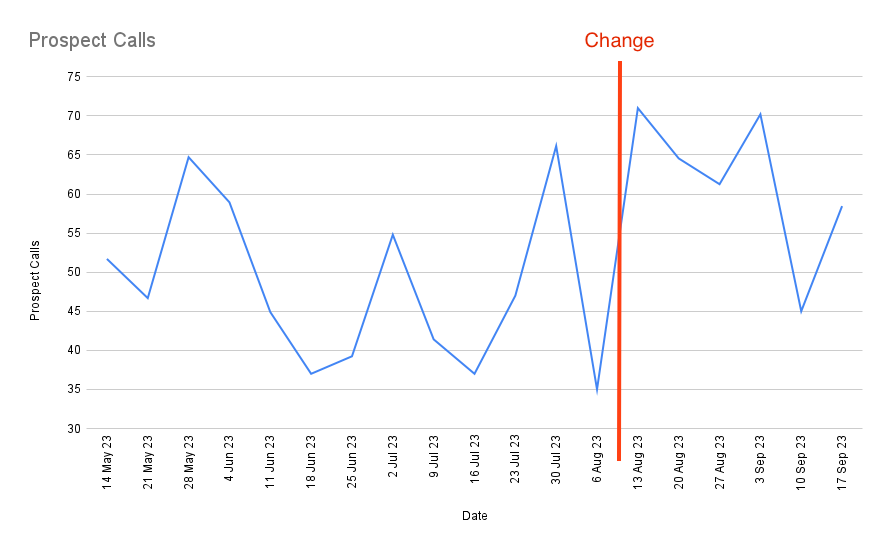
This might be a dumb thing to say, but let me ask you: when you open a business dashboard in your company, do you feel a little confused? Like you don’t know what to do? I mean, look at this chart. What can you conclude from it? Is the metric doing well? Is it going up overall? Is it business as usual? Or are things getting worse? Should you be worried?
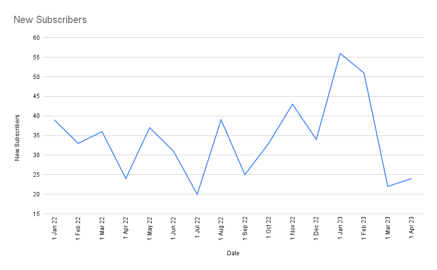
If you’re like most people — myself included — you would not know how to read actual charts of real world operational data. You would open up Google Analytics and think … “so what?”. Before I went down this rabbit hole, I found myself wishing for something like this:
Very smooth, very nice, very clear what’s happening.
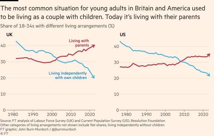
Or perhaps you might expect something like this:
Such clarity! Red is clearly worse than blue. Either way, it’s so beautiful, like it was worked over to make it understandable to regular folk (which it totally was; these charts were produced by Financial Times chief data reporter John Burn-Murdock).
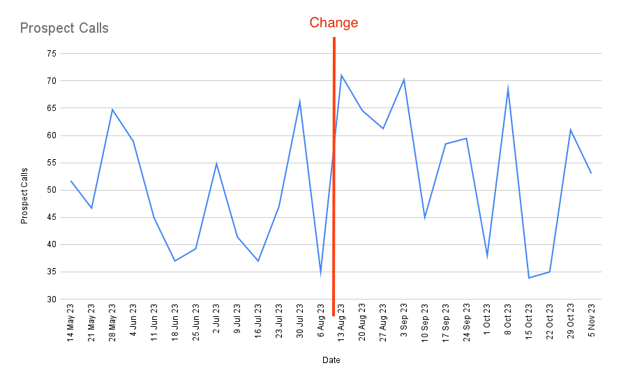
Unfortunately, when you open a random business dashboard in your company, you will see something like this:
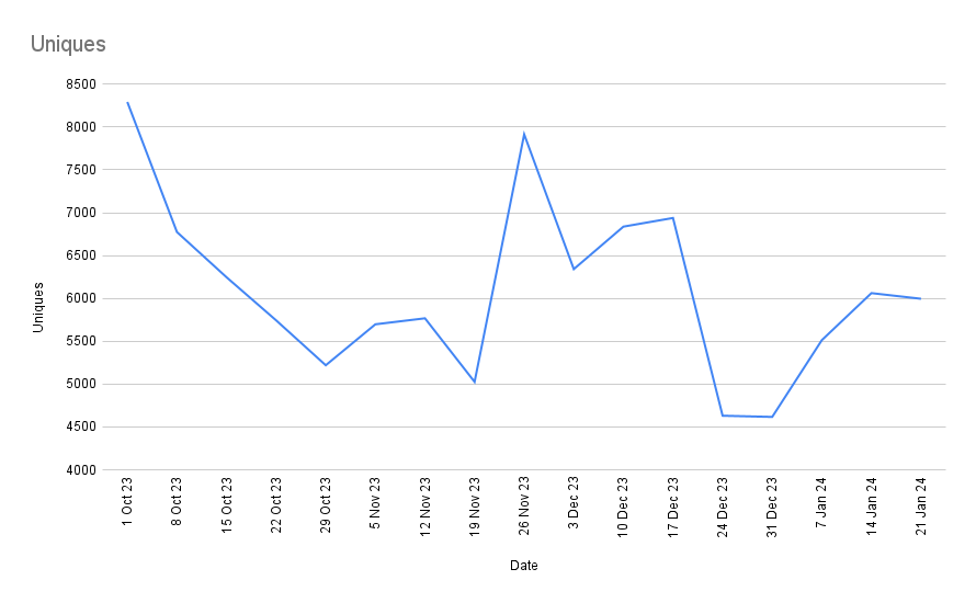
Most business charts will look like a crayon scribble by a two-year-old. This is more problematic than you might think.
Here are three examples to illustrate this, though I’m willing to bet that you may already be familiar with some of them.
You Don’t Know If You’ve Successfully Improved
Let’s say that you want to test if a new sales process is more effective. You make a change to the way Marketing Qualified Leads are vetted and wait a few weeks. Then you take a look at your data:
Did it work? Hmm. Maybe wait a few more weeks?
Did it work? Did it fail? Hmm. Perhaps it’s made an impact on some other metric? You take a look at a few other sales metrics but they’re all equally wiggly. You discern no clear pattern; you chalk it up to a “maaaybe?” and move on to the next idea. You don’t get any feedback on your moves. You’re like a blind archer, shooting arrows into the dark.
This is one reason people don’t close their loops.
You Waste Time Chasing Noise
Your boss opens up the sales meeting and says “Sales is 12% down for the month. This is very bad! We’re no longer on track to hit our quarterly targets!”
You’re told to look into it. You spend a huge amount of time investigating, and it turns out that … you can’t find anything wrong. Perhaps this is just normal variation?
Your boss doesn’t understand that, of course. He doesn’t understand that routine variation exists (if he did, he wouldn’t have asked you to investigate). So you make up some explanation, he accepts it, and then next month the number goes up again and everyone breathes a sigh of relief.
Until the next time the number goes down. Then you get yelled at again.
Sometimes You Set Dumb SLAs
You’re in charge of data infrastructure. You have a maximum latency SLA (Service Level Agreement) for some of your servers. Every week your latency metrics are piped into a Slack channel, with a % change, and a font colour that tells you if you’ve met your SLA.
Every two months or so, the latency for a key service violates your SLA. You get yelled at. “WHAT WENT WRONG?” your boss sends over the channel, tagging you.
You investigate but can’t find anything wrong. It doesn’t cross your mind that perhaps the process’s natural wiggling will — for some small % of the time — violate the SLA.
The problem is compounded by the fact that once every year or so, there is some root cause: some service goes awry; some engineer trips up during a deploy. The real solution to your ‘regular two month yelling’ isn’t to investigate routine variation; the solution is to completely rethink the process so that the entire range of variation lies below the SLA.
But nobody understands this, of course. So the yelling continues.
All Roads Lead to the Same Outcomes
The eventual outcome of all three scenarios is identical: you stop using data as an input to drive decision making. And why should you? The feedback you get is not clear. You don’t know if it’s good when a number goes up. You don’t know if it’s bad when a number goes down. This is not your fault. You’ve never been taught to look at operational charts properly, and the bulk of data publications out there somehow skip over this simple challenge. There are a hundred articles about how to set up a data warehouse but not one about how business users should read charts. It’s no wonder that most people stop.
If these metrics become part of some goal-setting system, then another predictable outcome will occur. Joiner’s Rule says:
When people are pressured to meet a target value there are three ways they can proceed:
1. They can work to improve the system
2. They can distort the system
3. Or they can distort the data
We’ve talked about this before — in the very first entry for this series, in fact — so I won’t go into great detail on how to deal with this. But I want to point out that Joiner’s Rule is tied to this … inability to deal with the wiggling. If you don’t know whether a metric is getting better or lousier as a result of your actions, and leadership doesn’t understand this but desires better measurable outcomes, what else can you do but to distort the system or distort the data?
The wiggling, as it turns out, is the root cause of a lot of problems with becoming data driven.
What are some common methods to solve for this? Some people attempt to use a moving average:
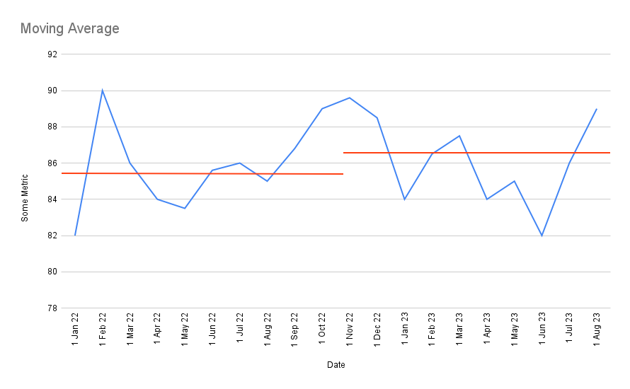
But the problem with the moving average is the lack of certainty. What if, say, the moving average after a change just happens to fluctuates up, you declare a successful change, and then a few weeks later it fluctuates back down? Does that represent a real shift? Hmm.
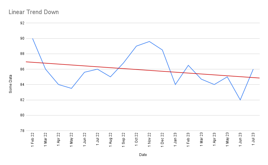
Or perhaps you should draw a linear trend line through the data?
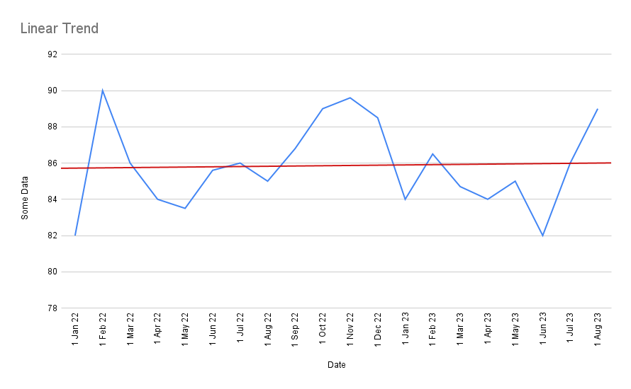
But the issue with a linear trend is that it takes very little to change the trend! If, for instance, you remove just the first and last data point above, you get a completely different line:
This challenge that I’ve just demonstrated to you are all symptoms of the same problem. They are a problem of understanding variation. A wiggling chart is difficult to read.
Unfortunately, all real world metrics demonstrate some amount of variation. If you weigh yourself every morning, for instance, you’ll find that your weight doesn’t stay exactly the same — instead it’ll fluctuate around some average point. Over time, assuming you eat more and exercise less, this fluctuation will drift upwards. But the mere fact that it wiggles makes it hard to tell. The wiggling is essentially noise. You hesitate, just a small amount, to say, “ok, today is the day that I have gained weight.”
In truth, the routine variation you experience when you weigh yourself daily is quite gentle. In business, it’s quite normal to get a graph with bigger swings but with perfectly routine variation:
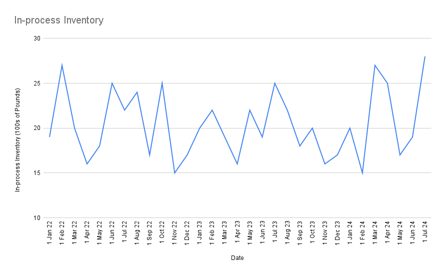
Here the swings look large on a percentage basis, but everything is business as usual. There is nothing to investigate here; nothing has changed, nothing special has occurred — you should expect to see swings this large even under normal operations.
Of course, if you look at this in terms of week-on-week change, this will look very concerning. In the last two months alone you’ve seen a 47% increase in In-process Inventory! And yet you’re expected to face leadership and tell them to ignore this?
The answer — assuming you’ve sufficiently internalised the nature of routine variation — is yes, yes you are.
The key idea here is that a large change is not necessarily worth investigating, and a small change is not necessarily benign. What you want to know is if the change is exceptional — if it’s larger than historical variance would indicate. Some large changes are just routine variation, because the underlying process swings around a lot. And some small changes (small, that is, in absolute terms) may be a signal that something is going catastrophically wrong with a business process, especially if that process has historically been very well behaved.
So what can you do about this?
What If It Doesn’t Have To Be This Way?
I want you to pause for a moment here to imagine an alternative. Let’s say that you have a tool that tells you, damn near certain, “yes, a change has occurred.” By implication, this magical tool is also able to tell you: “no, this change is just routine variation, you may ignore it.”
What might that do for you?
For starters, when you attempt to improve a process, you will know when things work. You will look at a wiggling chart and go “ok, we made this improvement at this point, and it took N weeks for the results to show up, but things are now fundamentally different. We know it’s worked.”
This seems like a small thing, but it leads to a number of non-obvious, knock-on effects. I’m going to give you a stylised account of what happens when you start using this magical tool. I say ‘stylised’ because a) my team have executed the Amazon-style WBR from day one, which bakes in many of these ideas, b) we are a tiny team, which means the political impact of these changes are more muted, and c) we’ve made a lot of dumb mistakes along the way.
That said, the following account is similar in spirit to what every person on my team has experienced over the past six months.
- You come into possession of this magical tool. The magical tool is a dumb charting technique that a high school student can compute by hand and plot. “Ok, let’s try this.” you say. You throw it at some metric that you care about, like website visitors. You try a bunch of things to improve the number of visitors to your website. Most of your efforts fail: your metric shows exactly the same variation as before and the magical tool tells you “NO CHANGE”. You say, “Holy shit, most of what we thought would work doesn’t actually work! What else do we believe that’s actually wrong?”
- You keep trying new changes, and this magical tool keeps telling you “no, there’s no change” repeatedly, and you start to lose faith. The metric goes up, and your tool says “no change”. The metric goes down, and your tool says “no change.” Someone on your team says “why is everything routine variation?” You might not know it, but this is actually a pivotal moment. This is, in reality, how your business actually works. Most things don’t move the needle on the metrics you care about, and you’re starting to internalise this. You’re starting to build an intuition for what might.
- At some point, one of two things will happen: either you make a change and then suddenly your tool screams SOMETHING CHANGED! Or — out of nowhere — something unexpected happens, and some subset of your metrics jump, and your tool screams SOMETHING CHANGED, and you scramble to investigate.
- You discover the thing that caused your website visitors to spike. The next week, you do the thing again, and the metric spikes again. You stop doing it, and your tool tells you “SOMETHING CHANGED” — your metric returns to the previous level of variation. So then you say “Wait a minute, if I do this thing, the metric behaves differently. So I should keep doing it, right? Maybe I should track how many times a week we do it?” Congratulations: you’ve just discovered controllable input metrics.
- You repeat steps 1 through 4, and over a series of months, you begin to discover more and more control factors that influence site visitors. (Spoiler alert: there typically aren’t that many. But the few that you discover truly work.) You disseminate this knowledge to the rest of your team, in particular the marketing team. Those who are following along on this journey of discovery are mind blown. They feel like they’re uncovering some ‘crystal structure in Nature under a microscope’ — some invisible causal structure that explains your business. At this point you say “wait a minute, what else can this be used for? Can it be used for … revenue?”
- You start to apply this to revenue, and the same thing happens. It’s routine variation for weeks or months as you search for things that impact revenue, and then something spikes, your tool screams SOMETHING CHANGED, you investigate, you discover either a) a new control factor — in which case you ask “how can we systematically do more of this?” and it works and revenue goes up — or b) a process failure — in which case you ask “how can we prevent this from happening again?” — and then you begin to systematically drive revenue up because you actually know what affects it.
- At this point you are convinced this methodology works, so you start applying it to everything in your company. Hiring problems? You instrument your hiring process and throw this magical tool at it. You discover both process failures in your hiring process and new control factors (perhaps hiring at university career fairs works really well?) and begin to do more of those. Costs? You start instrumenting various business costs and throw this tool at it, investigating instances where there are exceptional spikes or drops, creating new programs to replicate more of what you want (and here’s a real world case to illustrate that). Marketing performance? You instrument various parts of your marketing activities, and watch closely to see if changes in various marketing activities cause follow-on changes in downstream metrics. And you can do this because you have a tool that can confidently tell you when things have changed.
- At some point — perhaps by measuring marketing, which affects sales, which affects customer support — you realise that every goddamn metric is connected to every other goddamn metric in your company. The causal structure of your business does not care about departments. You realise that it makes sense to bring leaders from every department together to look at company metrics, so they can see how changes flow through the numbers from various departments and out to financial metrics out the other end. You notice that the financial impact of your decisions only show up after a lag. You realise this is important to communicate to your executives. After a few weeks of attending your metrics meetings, they too, eventually internalise this causal structure of the business. (Note: those who cannot adapt to this style of working select themselves out of the organisation. Real world example here).
- At this point you have the same causal model of the business in your heads. You have, in Deming’s parlance, knowledge. This knowledge is a living thing: it causes you to update your causal model as the result of continued experimentation. Some weeks you add new metrics in response to new control factors you’ve discovered, and in other weeks you remove metrics that have stopped being predictive. More importantly, this is a shared causal model: every executive who sits in on the meeting begins to understand how the entire system works. Borders between departments break down. Executives collaborate. They see how efforts might lead — with a lag — to improved financial outcomes (Hopefully their incentives are tied to growing enterprise value? Well you better get on that, and stat). People begin to internalise “hey, I can try new things, and can get relatively good feedback about the changes I try!” Eventually someone gets the bright idea to let software engineering leaders in on this meeting, because they can change the product in response to the causal model of the business — which then accelerates everyone’s knowledge of the causal model, since insight comes from experimentation, and the engineering team is now incentivised to pursue knowledge. They become just another part of the iteration cycle — not a siloed department with siloed goals.
- Mary, who has tried to get A/B testing to take off in the product department for the past two years, finally gets the green light to get an A/B testing program off the ground. Execs at the highest level finally see A/B testing for what it is: yet another way to pursue knowledge. “Why we didn’t do this earlier is beyond me,” says Jill, who heads Product, as she signs off on the expense necessary to build up an A/B testing capability.
- Finally, you recognise that you have a new problem: this metrics meeting becomes the single most expensive meeting you conduct every week. You have over 100 metrics. Every executive of consequence attends. You begin to search for ways to a) present a large number of metrics, b) that represent various changes in the company end-to-end, in c) an incredibly information dense format and d) you want to keep it to 60 minutes, since every hour of every executive’s time counts in the hundreds of dollars.
Congratulations, you’ve just invented the Amazon-style WBR.
The Trick
Have you noticed the trick yet?
Yes, the magical tool is interesting. Yes, it exists, and yes, we’ll talk about it in a second. But it’s not the magical tool that’s important in this story. It’s the cultural change that results from the tool that is more important. As Wheeler puts it: “Continuous Improvement is a style of thinking with a few tools attached.” We’ve talked about one tool. Now let’s talk about the style of thinking it enables.
What is the worldview that arises from this series of events? “The worldview is around knowledge” you might say. “Your organisation has learnt to pursue knowledge.”
This is accurate, and in fact one of the earlier entries in the Data Driven Series is titled “Operational Excellence is the Pursuit of Knowledge.” Let’s call this the ‘process control worldview’: every business is a process, and processes may be decomposed into multiple smaller processes. Each process you look at will have outputs that you care about and inputs that you must discover. But this worldview is more subtle and more powerful than you might think. One way of illustrating this power is to juxtapose it with the mainstream alternative — the default way of thinking about data that most of us come equipped with.
Most people approach data with an ‘optimisation worldview’. (Special thanks to Ergest Xheblati and Shachar Meir for this observation). Crudely speaking, they think in terms of “make number go up.” This is not wrong, but it is limiting. When presented with some metric, such as profits, or sales, or MQLs (Marketing Qualified Leads), they naturally ask: “I want to make number go up, and the way I will do this is I will set a Big Hairy Audacious Goal.” (Never mind that nobody knows how to hit the goal, setting the goal is inspirational and inspiration is all you need). At most, they will take one step back and ask: “What is the conversion step for this number, say on a funnel?” But then they will return to the optimisation question immediately after asking this: “How do we make that conversion % go up?” This mindset often coexists with things like arbitrary quarterly or yearly goals, where management comes around and says “Ok guys, our goal for this quarter is 15% more sales than last quarter. Chop chop!” It also leads to statements like “Why should you be data driven? Data is just about eking out minor improvements (optimisation). The really discontinuous jumps in business are from big new bets.”
The process control worldview is different. It says: “Here is a process. Your job is to discover all the control factors that affect this process. To help you accomplish this, we will give you a data tool that tells you when the process has changed. You will discover these control factors through one of two ways: either you run experiments and then see if they work, or you observe sudden, unexplained special variation in your data, which you must then investigate to uncover new control factors that you don’t already know about. Your job is to figure out what you can control that affects the process, and then systematically pursue that.”
Notice the difference in stance. In this worldview, the goal is ‘uncovering the causal nature of the process.’ (And yes: your business is itself a process.) Uncovering the causal structure of your business informs your business intuition; it doesn’t stand in opposition to making large discontinuous bets. In fact, anyone who says “oh, why bother being data driven, it’s just minor improvements” is almost certainly unaware of the process control worldview; they are likely arguing from the optimisation worldview alone.
But hold on, you might say, both of these approaches seem quite compatible! Surely you want ‘number go up’! What if you set goals, but at the same time inculcate a culture of ‘identify the control factors before pursuing those goals’. Wouldn’t this synthesis be good? And you would be right: Amazon, for instance, has a famous OP1/OP2 goal-setting cycle that is similar to OKR practices in many other large companies; they just happen to also have a strong process control approach to their metrics. Early Amazon exec Colin Bryar told me that it was always important for leadership to incentivise the right controllable input metrics, and to avoid punishing employees when leadership selected the wrong input metrics. This was a theme that came up in my essay about Goodhart’s Law, and also in our podcast together.
But it’s important to understand that the process control worldview opens the door to a few vastly more interesting organisational setups.
For instance, consider: if your whole worldview is to systematically identify and then pursue control factors in service of improving a process … why stop at a goal? What if you design an org structure that incentivises workers to constantly search for the pragmatic limit, and then pursue improvements right up to that limit? In this worldview, the endpoint is whatever you discover to be the ‘true’ or ‘economic’ limit, not some arbitrary number pulled out of management’s ass.
In 1979, Japanese car company Mazda sold 25% of their company to the American car manufacturer Ford. In his book Deming’s Journey to Profound Knowledge, author John Willis documents what happens next:
Recall from the Mazda-Go story that Mazda had sold one-quarter of the company to Ford. (This happened the year before the NBC special.) Ford began manufacturing an identical transmission to Mazda’s. Customers and dealers, however, began saying the cars with transmissions made in Japan were better than those made in America. This was clearly impossible since the transmissions were made to the exact same specifications. Ford chalked it up to people believing (rightly so) that anything made in Japan was superior to anything made in the USA.
Upon further investigation, though, Ford discovered something intriguing. They took the transmissions apart and compared them, part for part. The American-made transmissions had a quality tolerance of one-eighth of an inch—exactly what the specs called for. The Mazda-made transmissions, however, had a tolerance of one-sixteenth of an inch. That is, the Japanese delivered twice the quality called for. They really were superior. But how? Why was Mazda twice as good as its American counterpart? No one could tell Petersen why. Most of the Ford engineers didn’t believe that simply tightening tolerance limits was the answer to enhanced quality; they wanted a better explanation.
Ultimately, it was a question of pragmatism. Just as [pragmatic philosopher] C. S. Pierce realized that there was a pragmatic limit to improving his pendulums, the Mazda engineers found the pragmatic, economic limit of reducing the tolerance limits of its transmissions. That’s why they stopped at one-sixteenth instead of going with an even tighter tolerance of one-thirty-second. At Ford, [Deming] was able to explain how to use statistical process control to find that pragmatic limit.
Think about the kind of organisational culture necessary to enable this sort of continuous improvement. If you have a culture of yearly OKRs, your workers might not to be incentivised to exceed the goals you’ve set out for them. After all, next year’s goals will simply be set a little higher. Best to keep some improvement in reserve. It takes a different kind of incentive structure to create a culture of ceaseless improvement, pushing outcomes across the company — from transmission tolerances right up to financial profits — all the way against the pragmatic limit, making tradeoffs with other important output metrics, watching for bad side effects and controlling for those; searching after and then pushing control factor after control factor in a complex causal system, goals be damned.
I’m not saying that this is the natural result of these ideas. Certainly you can get good results just teaching the process control worldview within your existing OKR planning cycles. All I’m saying is that historically, these ideas have led to far more interesting organisational setups than the typical OKR/MBO (Management By Objectives) style of company management that we see in the West.
How interesting? Well, amongst other things, these ideas have led to the Toyota Production System, which in turn has led to the discovery of Process Power — one of Hamilton Helmer’s 7 Powers (i.e. there are only seven sustainable competitive advantages in business and Process Power is one of them; Toyota is amongst the largest and most profitable car companies in the world as a result of this). It turns out that the org structure necessary to fully exploit this insight becomes a formidable competitive advantage on its own.
I’ll leave this topic for now; Commoncog will publish more about it in the future. (Update: it has).
The Magical Tool
Let’s return to the sequence of ideas I’ve outlined in the prior section. What is this magical tool? How does it work? How do you use it?
The magical tool is something called a Process Behaviour Chart. Commoncog members who have been following the Data Driven Series should skip this section; we’ve talked about PBCs extensively in Part 2: How to Become Data Driven and Part 5: Process Behaviour Charts: More Than You Need To Know. If you are already familiar with this literature, I recommend skipping forward to the section titled ‘The Intuition Behind XmR Charts’, below.
If you are not a member, or you’re new to Commoncog, I’ll give you a thumbnail sketch of this tool, and then I’ll link to some external resources. As we’ve seen, this tool is powerful, but what it is is that it’s really a gateway drug. It is more important for what it enables.
The PBC goes by many names: in the 1930s to 50s, it was called the ‘Shewhart chart’, named after its inventor — Deming’s mentor — the statistician Walter Shewhart. From the 50s onwards it was mostly called the ‘Process Control Chart’. We shall use the name ‘Process Behaviour Chart’ in this essay, which statistician Donald Wheeler proposed in his book Understanding Variation, out of frustration with decades of student confusion.
Of all the PBCs, the most ubiquitous (and useful!) chart is the ‘XmR chart’. This is so named because it consists of two charts: an ‘X’ chart (where X is the metric you’re measuring), and a Moving Range chart.
It looks like this:
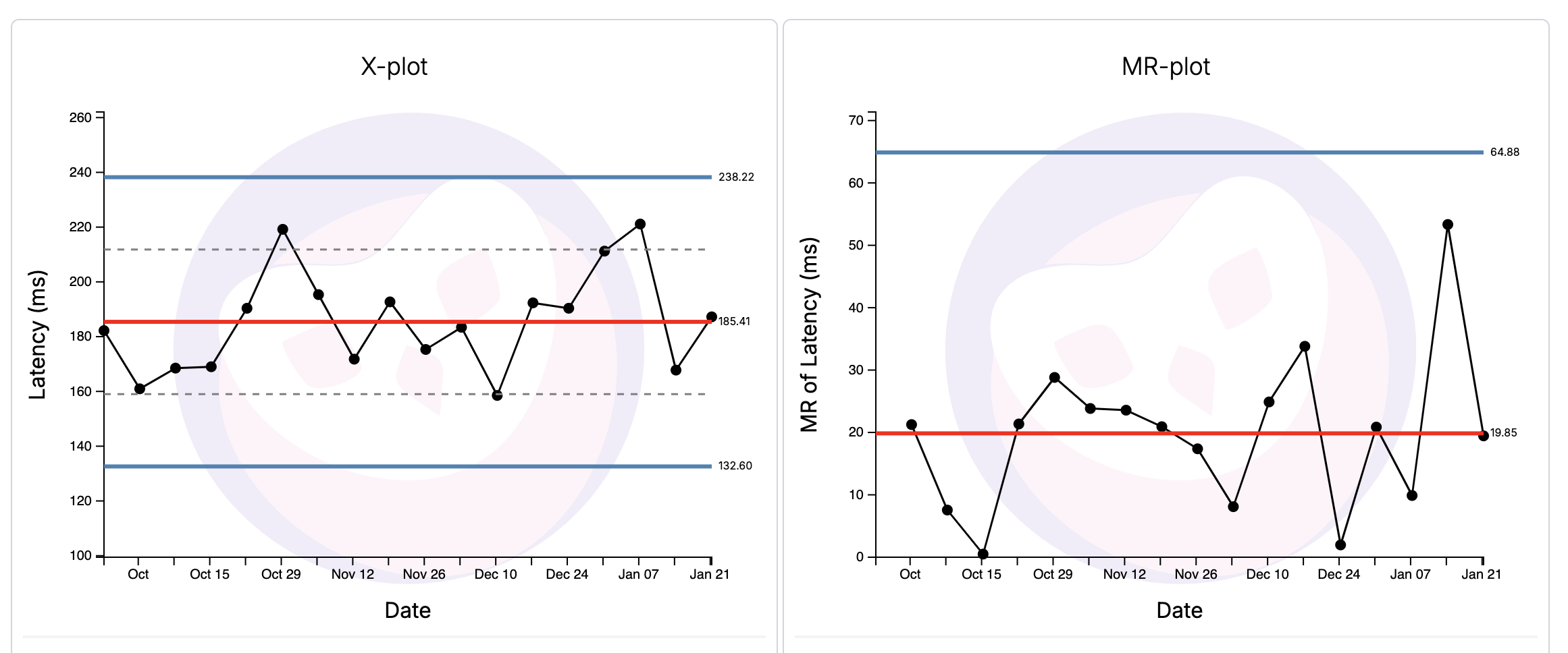
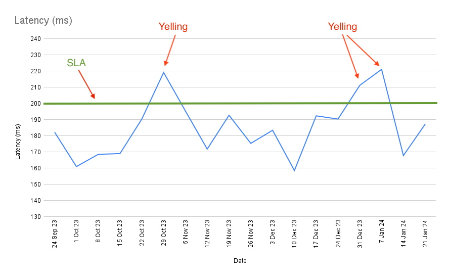
Using the XmR chart to Characterise Process Behaviour
The XmR chart tells you two big things. First, it characterises process behaviour. The chart above tells me that latency for this service is completely predictable, and will fluctuate between 238ms and 132ms assuming nothing fundamentally changes with the process. This is what we call ‘routine variation’.
Why is this useful? Well, let’s say that I have an SLA of 200ms (the process shouldn’t go above the green line):
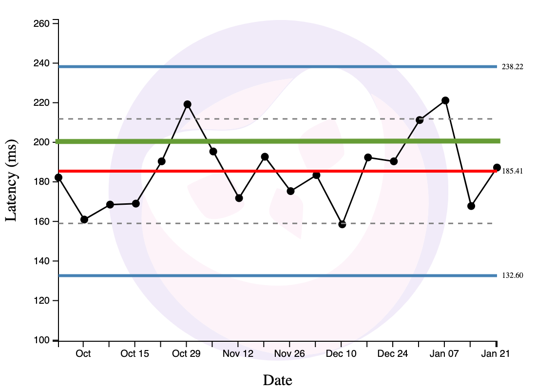
This XmR chart tells me that some % of the time, the process will fluctuate above the SLA through no fault of its operators. We now have two options: first, we might want to adjust the SLA upwards — ideally above 238ms. Perhaps the SLA is unreasonable. Perhaps it’s ok to just have process behaviour fluctuate within this steady range.
But perhaps the SLA is not unreasonable, and it’s the process behaviour that is problematic. Our second option is to completely rethink the process. Our goal is to either a) shrink the bounds, or b) shift the range of variation below the SLA line. As it is right now, the process is completely predictable. Completely predictable processes show only routine variation; they are performing as well as they can … assuming nothing changes. This implies that there’s no use investigating specific points that violate the SLA — there’s nothing unusual happening! To shift the bounds of its variation, we need to fundamentally redesign the process.
I’ve just shown you how the XmR chart may be used to characterise process behaviour. But it is able to tell us one other thing. It tells us when exceptional variation has occurred.
Using the XmR Chart to Detect Exceptional Variation
Exceptional (or special) variation here means that something meaningful has changed. If a process shows exceptional variation in response to some change we’ve made, it means that our change has worked, and the process will perhaps shift to some new pattern of routine variation. But if we suddenly see some special variation that is unexpected (i.e. not the result of any change that we’ve made), then the process is unpredictable — there is something unknown that is going on, and we need to investigate.
Unpredictable processes are processes that show special and routine variation. SPC teaches us that you cannot improve an unpredictable process. Why? Well, an unpredictable process means that there is some exogenous factor that you’re not accounting for, that will interfere with your attempts to improve your process. Go figure out what that factor is first, and then change your process to account for it.
How does the XmR chart tell you these things? It has a set of rules. Historically there have been many rules. Wheeler has simplified it down to just three.
Rule 1: When a Point is Outside the Limit Lines
When a point is outside the limit lines on either the X chart or the MR chart, this is a strong source of special variation and you should investigate.
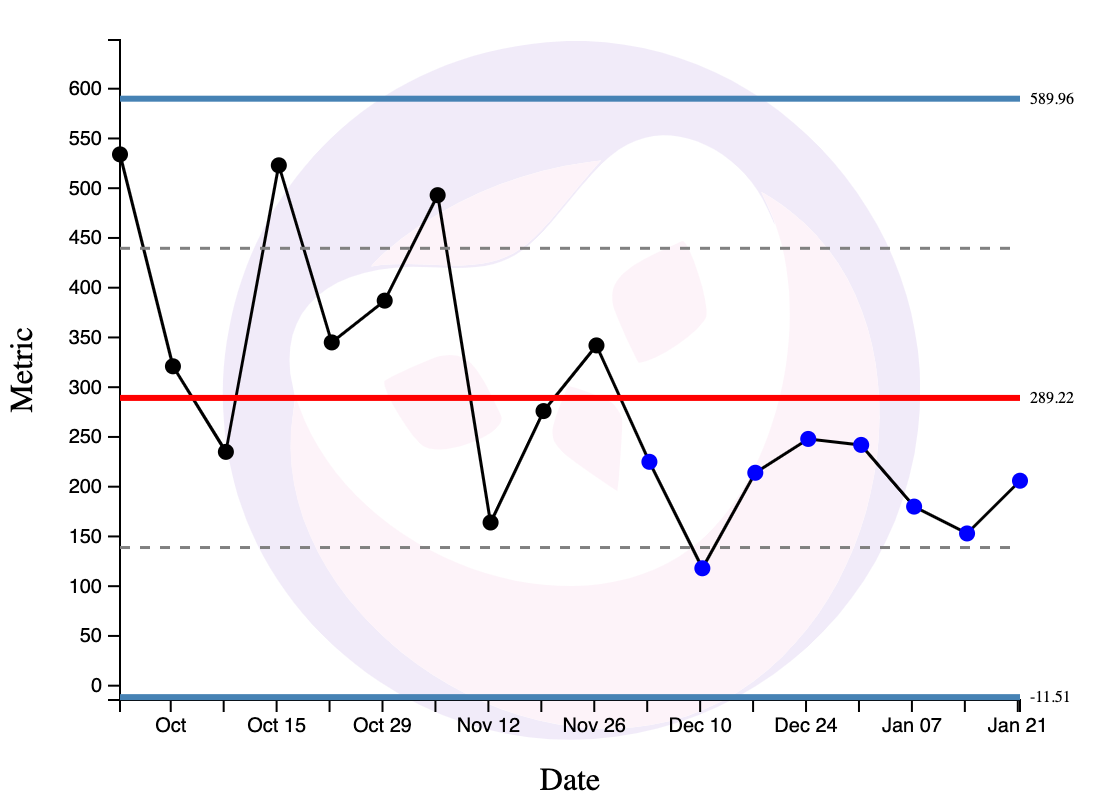
Rule 2: When Three out of Four Consecutive Points are Nearer to a Limit than the Centre Line
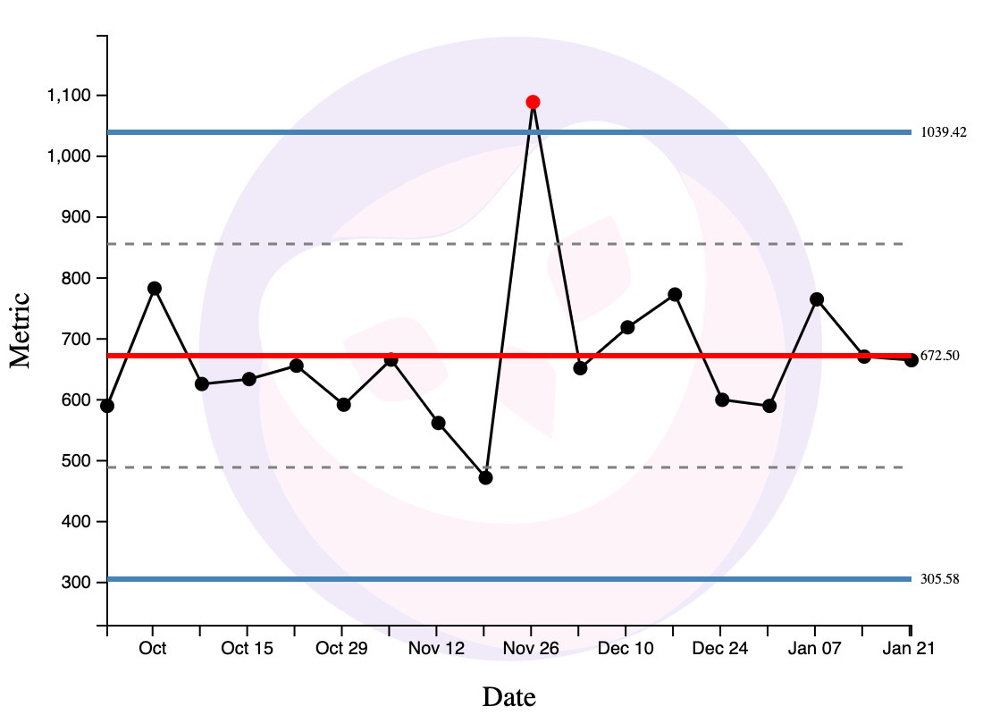
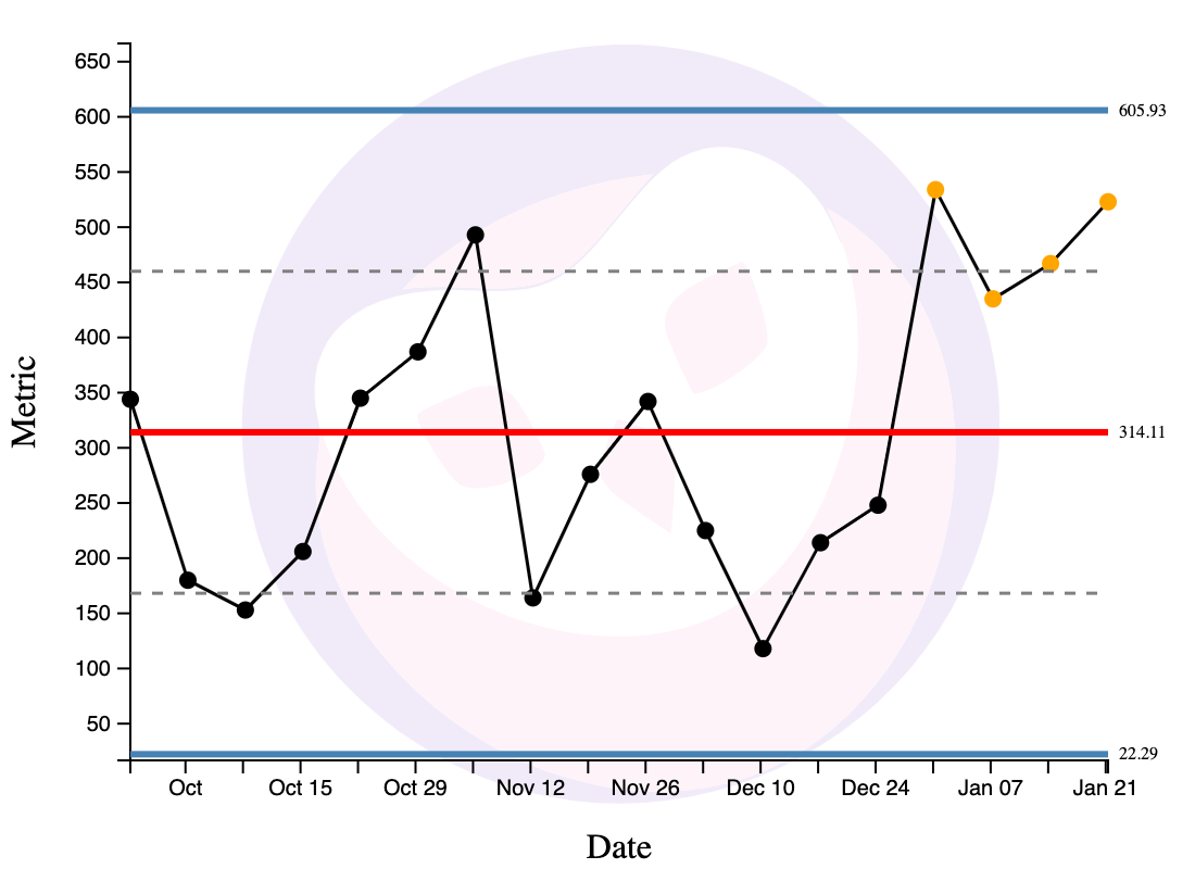
When three out of four consecutive points are nearer to a limit than to the centre line, this is a moderate source of special variation and you should investigate. In the chart below, the dotted line is the mid-point between the centre line (in red) and the limit lines (in blue). Three out of four of the yellow points are above that dotted line, and are therefore nearer to the limit line (the blue line at 605.93) than the centre line.
Rule 3: When Eight Points Lie on One Side of the Centre Line
When eight points lie on one side of the central line, this is a subtle source of special variation and you should investigate.
And that’s it. Two basic uses, three rules. That’s your magical tool.
The Intuition Behind XmR Charts
I don’t want to bog you down with details on how to plot XmR charts. Nor do I want to talk about the limitations of XmR charts — and there are a few. For starters, I’ve already covered this in great detail for Commoncog members; second, there are widely available resources elsewhere. I recommend this article from Xmrit.
If you are still hungry for more information about XmR charts, I recommend that you head over to Xmrit — where we’ve released some free software and resources on using XmR charts:
Xmrit gives you the ability to create and share XmR charts
Xmrit is a project incubated by Commoncog.
It allows operators to create XmR charts easily, and for free: it is open sourced, and is funded by The Metrics Masterclass, a soup-to-nuts course on using XmR charts in your business.
What I want to do here is to give you a rough intuition for why XmR charts work. This information is not readily available in one place, and you’ll have to spend a few hours reading Wheeler’s various Quality Digest columns to get to a good answer.
The intuition goes like this: all processes show some amount of routine variation, yes? We may characterise this variation as drawing from some kind of probability distribution. What kind of probability distribution? We do not care. When Shewhart created this method in the 30s, he was working on phone manufacturing problems for Bell Labs, and he understood that it was ridiculous to ask production engineers to identify the ‘right’ probability distribution on the factory floor. So he designed his methods to work for most probability distributions that you would find in the wild.
What the XmR chart does is to detect the presence of more than one probability distribution in the variation observed in a set of data. We do not care about the exact nature of the probability distributions present, only the number of them. If your process is predictable, the variation it shows may be said to be ‘routine’, or to draw from just one probability distribution. On the other hand, when you’ve successfully changed your process, the data you’ll observe after your change will show different variation from before. We can say that your time series will show variation drawn from two probability distributions. Also: if some unexpected, external event impacts your process, we may also say that we’re now drawing from some other probability distribution at the same time.
The XmR chart does this detection by estimating three sigma around a centre line. Shewhart chose these limits for pragmatic reasons: he thought that it was good enough to detect the presence of a second (or third, etc) probability distribution. Naturally, if a point falls outside the three sigma limits, something exceptional is going on — there’s likely another source of variation present. The other two detection rules are run-based (they depend on sequential data points in a time series) and are designed to detect the presence of moderately different probability distributions. For the vast majority of real world distributions, XmR charts will have a ~3% false positive rate. This is more than good enough for business experimentation.
(Sidenote: it is important to note that you should not use a standard deviation calculation to get your limit lines. A standard deviation calculation assumes that all the variation observed is drawn from one probability distribution … which defeats the whole point of an XmR chart! The XmR chart does not assume this; its whole purpose is to test for homogeneity. Wheeler takes great pains to say that you need to estimate your limits from a moving range.)
Why am I giving you this intuition? Well, for some people at least, the heart cannot follow what the head rejects as false. There are some implications that fall out of this approach:
- For starters, you do not need a lot of data to use XmR charts. Often I hear people say things like “I want to be more data driven but my business is so small, I don’t have that much data.” And indeed lack of data makes it harder to do some things, like A/B tests. But XmR charts are designed to detect changes in data — and it doesn’t matter if you have comparatively little data. Consider this: after WW2 Deming taught these methods to Japanese companies with starving workers, bombed out factories, and barely any production to speak of. It worked — they rebuilt their industrial base in four years, and overtook the US a decade later. In 1992 Donald Wheeler taught these methods to a Japanese nightclub, and had the waitresses, bartenders, and managers learn this approach to improve their business. It worked. The point is that uncovering the causal structure of your business is something that can work for businesses of any scale. If it can work for bombed out Japanese industrialists; if it can work for a tiny night club, it can work for you.
- Second, XmR charts do not require you to be statistically sophisticated. It helps to have some knowledge of how they work, of course. But even in the worst case, they were designed to be followed somewhat blindly by the 30s-era factory manager (and in my case, the statistical argument behind them can be understood despite my piss-poor undergrad-level stats background). Shewhart designed them to work for just about any sort of production data; Deming later realised it could be applied more broadly. At this point, the method is 90+ years old. To say that it’s been battle tested is to put it lightly.
- Third, and finally, I’ve been using XmR charts for about six months now, and I can confirm that they work for a very large number of business processes. If they do not, it is usually very clear that they’ve failed (think seconds, not days — you can usually tell the instant you plot one). I get a lot of comments from folk with industrial engineering backgrounds who tell me “these methods don’t work because they only apply to predictable, repeatable processes.” To these people I say: “Have you tried? Why don’t you give it a go?” You will find that most people haven’t actually tried — at least, not outside the factory. In truth, there is nothing in the statistical argument underpinning XmR charts to suggest that they can only work in manufacturing. The key requirement is that your process displays routine variation. And you will find — like we did, over and over again — that there are a great many business processes that do.
(Note: for those who are interested, the statistical arguments for the above may be found in Wheeler’s columns, here, here, here, here, here and here.)
Moving Beyond the XmR Chart
We’ve just spent a fair bit of time talking about XmR charts as this ‘magical tool’. And, yes, they are powerful — in fact they’re probably underrated given their impact on the world. But I don’t want to overstate their importance. At some point, after you’ve gone down this path long enough, after you’ve transformed your organisation to think in this way, you should discover that you no longer need to use them.
This is a little wild to say! I’ll admit that — as I’m writing this — my team and I are not able to do without XmR charts. But Toyota no longer uses them. Many divisions in Amazon do not use them. And in fact, as we’ll soon see, the Amazon WBR may draw from the process control worldview, but it does not use process behaviour charts of any type. Sure, certain departments in Amazon still do use XmR charts; they are common in many operationally intensive companies. But it’s not much of a stretch to say that they are optional, and that not all data driven companies use them.
So what are they good for?
Wheeler likes to say that XmR charts are the beginning of knowledge. What he means by this, I think, is simple: the XmR chart is the quickest, most effective way to create org-wide understanding of variation. Put differently, the XmR chart — while also effective as an operational tool — is most potent as a cultural transformation lever. And this is because they’re so easy to plot, so easy to teach, and simple enough that misuse is easy to detect.
Once you understand variation, you’ve basically unlocked the process control worldview; you’re well on your way to becoming data driven. You can chase down root causes; you can peel back the causal structure of your business; you no longer have to treat your business as a black box. You will begin to look askance at those who use the optimisation worldview. Wheeler has observed that those who successfully adopt PBCs are quite likely to find their way to Continuous Improvement. At which point, your entire org will be ready to move on to more sophisticated tools.
And that’s the open secret, isn’t it? XmR charts are uniquely effective at teaching variation, but there are plenty of data driven operators who understand variation without them. They are not strictly necessary. Colin told me that if you looked at operational data often enough, and for long enough, you would be able to recognise the difference between routine and special variation. You would feel the seasonality in your bones. “Human beings are very good pattern matching machines” he said, “You should let humans do what they’re good at.”
This tacit understanding of variation came up again and again as I sought out and interviewed data-driven operators from multiple companies over the past year. It’s not a coincidence that I did a podcast with executive coach Eric Nehrlich in mid-2023. Nehrlich was part of a team that got Google’s revenue forecasting error rate down from 10-20% to ~0.5% over a period of a few years. Half our interview was about his experience:
Eric Nehrlich: Yeah, I think the main thing people would get wrong is panicking when the number is below the forecast. So what's gonna happen is, you're gonna have a forecast, the CEO's gonna look at it, and they're gonna say, we're below forecast! Something must be wrong! You have a big fire drill that everybody has to go into alert mode to figure it out (emphasis mine).
It's like, okay, if we are trying to make an accurate forecast, one that is actually trying to predict it, we should try to be 50% above, 50% below. We should expect to be below the forecast 50% of the time.
Cedric Chin: Right.
Eric Nehrlich: And if we're not setting that expectation, if we want to make it a forecast that we always beat, then we need to make a different forecast. And so this gets back to the question of what purpose is the forecast meant to serve? If it's meant to be accurate, you have to be prepared that there's gonna be negative days. And sometimes big negative days because, as we know from variation, one out of a hundred days is gonna be three sigma away.
Cedric Chin: Yeah.
Eric Nehrlich: That's just math. But if you don't have that intuition that you've developed, or that I developed — if it's like 5% below forecast a week in a row, then I start to worry. Like okay, there's something going on. Maybe there's some exogenous factor we're missing. Something's going on.
But if it's one day below, one day above, it's generally not worth worrying about. So I think that's kind of the point. It's educating yourself on that and then educating your stakeholders. Like this is what we expect. We expect some above, some below (emphasis mine).
This should not surprise us. The SPC pioneers believed that the first step to becoming data driven was understanding variation. Put differently: if you do not understand variation, then you are data illiterate. It shouldn’t surprise us that all data-driven operators have a deep understanding of variation!
So why is this an open secret? Why is it that some people can come to understand variation, but most of us do not? Why is it that ‘understanding variation’ is news to so many of us?
I think there are two contributing factors: the first is that nobody seems to teach this — at least not beyond the factory floor. Sure, Deming was willing to teach his methods to anyone who listened, and he knew goddamn well they worked beyond manufacturing — but then he mostly taught them to manufacturing companies and then he died. So for some bloody reason these ideas are only taught to operations research folk and industrial engineers today, and for generations afterwards they say, with total confidence, “this only works for reducing variation in, uh, screws, but you can’t apply this to your business more broadly” without actually checking if it were true.
(To be fair, you can find these ideas applied in hospitals and in schools now, but when presented with this information, the folk I’ve talked to tend to wave their hands and go “oh, those are factory-like; they would never work for software engineering”. Which, really? Have you tried?)
Which leaves us with the second factor: if nobody teaches this, then a tacit understanding of variation only emerges if you have the opportunity to look at lots of data at work! This is incredibly depressing. It implies that you cannot become data driven in a company with no prevailing culture of looking at data. The incentives simply work against you. And since the vast majority of businesses are not run on data, this means that you have to get very, very lucky to learn this tacit understanding on your own. You have to get as lucky as Jeff Bezos did, when Amazon hired manufacturing savant Jeff Wilke from AlliedSignal. And then you had to be smart enough, and curious enough, to notice that Wilke was reorganising Amazon’s warehouses into factories — Fulfilment Centers, he called them — and that he was applying all of these ideas to solve Amazon’s distribution problems. And then you have to make the conceptual leap: Hey, what if I treated my whole business as a process? Would that work?
And then you would have to find out that it did.
Wrapping Up
The thing that drives me nuts about most books or articles on ‘being data driven’ is that — when pushed — everyone is always a little hand-wavy about how, exactly, one can become data driven.
I have never, not once, seen a data tool vendor or data publication explain how one might go from topics like ‘the modern data stack!’ or ‘the rise of the analytics engineer!’ or ‘data: product vs service org?’ to ‘here’s how you build a culture of data-driven business operators.’
Instead, when pushed to talk about the business, you get word salad like “by improving data analytics capabilities, companies can make data-driven decisions that optimise processes and resource allocation to improve efficiency and profitability in an ever-evolving business landscape.” This is not wrong, but … how?
Well, I’ve just shown you how. In this essay I’ve given you:
- A desired end state: when a company is data driven, they are culturally set up to pursue knowledge.
- A proven, 90-year-old mechanism for achieving that end state: process behaviour charts, which will inculcate a deep understanding of variation and will train people to adopt the ‘process control worldview’. An important consequence of this worldview is that insight is derived from action, not analysis: you only learn to improve your business when you test control factors, not when you discover them.
- A test for how you know you’ve succeeded: when your organisation actively pursues knowledge in everything that they do.
The key argument I want to reiterate is that the XmR chart is not the point — the pursuit of knowledge is the point. Understanding variation leads to the process control worldview, which leads to an org-wide pursuit of knowledge.
When you leave the XmR chart behind, what does the ‘pursuit of knowledge’ really mean? It means seeking out all the causal factors that power your business. It means equipping your employees with the ability to better predict the outcomes of their business actions. So:
- When you interview customers rigorously, you are actually pursuing knowledge. Jobs-to-be-Done interviews illuminate the buyer’s journey and give you new levers to influence your customers’s purchasing decisions. Sales Safari interviews help you identify the Pains, Worldviews and Jargon that customers use when evaluating your product. This is actually easy to do because you do not have to deal with variation. Both types of interview allow you to better predict the outcomes of your sales and marketing initiatives. Your organisation will say things like “Let’s not randomly throw marketing dollars at the wall, let’s go gain knowledge first. Let’s spend two weeks interviewing customers (or collecting quantitative data!) so we execute with better knowledge.”
- When Amazon switched to Free Cash Flow as its primary financial measure under CFO Warren Jenson, they built a tool that would tell employees the FCF impact of every product decision they made. Offer discounts? Increase inventory? Change fulfilment paths? Buy from different suppliers? Every merchant, finance analyst, and optimisation modeler could see the downstream impact on contribution profit, and therefore free cash flow, nearly immediately. The development of this tool was in pursuit of knowledge. (Source)
- When Alan Mulally forced every Ford executive to attend a weekly Business Plan Review, he did so with the intent that they got the end-to-end feel of the various parts of the business — from R&D indicators all the way to working capital. Mulally used this to force incompetent, politicking execs out. For the execs who remained, this meeting gave them a causal understanding of Ford; the goal was the pursuit of knowledge.
- When Bernard Paulson began systematically isolating each production unit in Koch Industries’s Pine Bend refinery, he was looking for knowledge. (This is not surprising; Koch Industries is a huge Deming shop). He experimented with various process inputs, figuring out the best combination of input materials and output products, matched those with prevailing market prices, and then used this knowledge to operate Pine Bend in a way that maximised long term cash flow. Koch would use the cash over the next few decades to fund expansion in other parts of the conglomerate. Koch HQ did not set revenue targets; they focused on long-term profit growth. Later, Paulson turned his methods outwards, analysing competitive pipelines and refineries, identifying acquisition targets for the nascent private equity practice that Charles Koch had set up inside the conglomerate. All of this was in the pursuit of knowledge.
I can go on, but I think you get the idea.
I hope you understand now, after reading this essay, why Colin said that Amazon used the WBR to ‘devastating effect’ against its competitors. I hope you might have a clue as to how Deming’s methods helped the US ramp up war production from a standing start: from nothing to supplying two thirds of all Allied war materiel in a matter of years. Perhaps you should no longer find it surprising that these ideas helped rebuild Japanese industrial capability after the war, and why a Japanese CEO would accost Deming at a dinner party to proudly brandish his company’s control charts. And finally, I think you can guess how Koch Industries expanded into one of the largest, most powerful private companies in the United States, without ever taking on a dollar of external equity capital.
It is very hard to compete against a company that pursues knowledge. This is one path to becoming data driven.
Now what are you going to do about it?
Read the next instalment here: The Amazon Weekly Business Review.
In the next instalment of the Becoming Data Driven Series, we’ll be talking about the Amazon-style Weekly Business Review, which builds on the ideas in this essay. I’d like to thank Colin Bryar for teaching me the WBR, to Eric Nehrlich for talking with me about his experiences working on Google’s revenue forecasting; to Ergest Xheblati and Shachar Meir for the ‘Optimisation Worldview vs Scientific Worldview’ dichotomy.
Originally published , last updated .
This article is part of the Operations topic cluster, which belongs to the Business Expertise Triad. Read more from this topic here→
The thought of business school make you go ‘eww’?
You’re in good company.
9,000+ investors and operators read Commoncog to sharpen their business acumen ... WITHOUT going back to school.
Sign up for our newsletter and get a weekly dose of good business thinking (no BS guaranteed):